

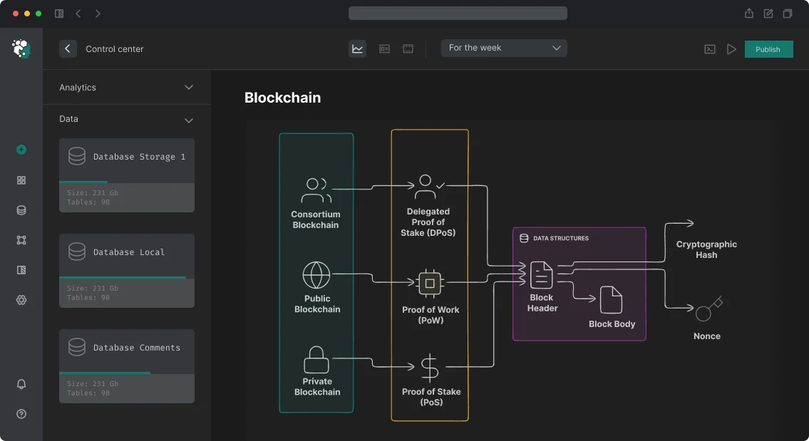
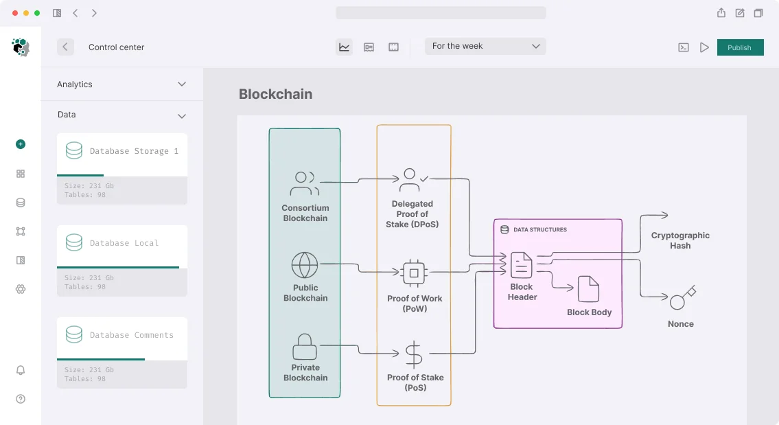
משגר קריפטו (Launchpad) פועל תחת לחץ זמן קיצוני: ה-IDO נפתח ב-15:00 UTC, ו-5 דקות לפני כן העמוד לא נטען, הכפתור לא מגיב, הארנק קופא. זה לא מקרה קצה — זה תרחיש מובטח עם 10,000 משתמשים בו-זמנית. אנו מעצבים את חוויית המשתמש (UX) עם זה בחשבון, ומבטיחים יציבות גם בעומס שיא. ארכיטקטורת ממשק נכונה מפחיתה את שיעור כישלונות ה-IDO ב-60%, וזמן טעינת העמוד הממוצע נשאר מתחת ל-0.5 שניות.
עיצוב ממשק ה-IDO לאלפי משתמשים בו-זמנית
כל שלב ב-IDO דורש מצב ממשק ברור: גילוי, בדיקת זכאות, הרשמה, רכישה, לאחר רכישה. למסך הרכישה, הפשטות היא המפתח: שדה הזנת סכום, תצוגת הקצאה, וכפתור approve → buy. מצבים: סרק → אישור USDC → אישור רכישה → הצלחה / שגיאה. שגיאות חייבות להיות קריאות לבני אדם, לא execution reverted. מפה סיבות revert להודעות ממשק כמו "ההקצאה שלך מוצתה." כפי שצוין בתיעוד Ethereum: "עסקה נחשבת סופית לאחר שנכללה בבלוק ו-12 אישורים נוספים." בהתאם, המשתמש צריך לראות התקדמות אישור.
למה מסע המשקיע ומסע ה-Staker צריכים להיות נפרדים
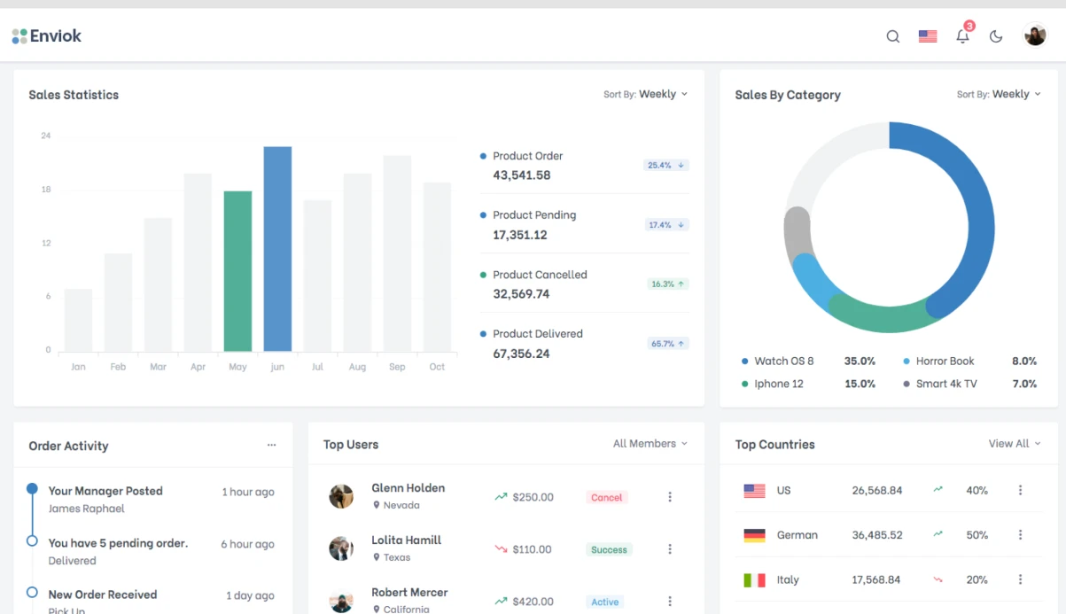
מסע משקיע — רכישת טוקנים של פרויקט. מסע Staker — החזקת טוקנים של הפלטפורמה כדי להרוויח דרגות. עבור Stakers: לוח מחוונים המציג את הדרגה הנוכחית, מחשבון "החזק X טוקנים למשך Y ימים → דרגה Z → הקצאה $W", היסטוריית החזקה. עבור פרויקטים: טופס הגשה ולוח מחוונים לניטור IDO בזמן אמת. ההפרדה מפחיתה עומס קוגניטיבי ומגדילה את ההמרה ב-30%.
רכיבי ממשק מרכזיים
ספירה לאחור ולחץ זמן
שעון הספירה לאחור הוא אחד האלמנטים הטעונים ביותר פסיכולוגית.
- סנכרון עם חותמת הזמן של הבלוקצ'יין, לא עם שעון הלקוח.
- כשנותרו פחות מ-5 דקות, הגדל את המשקל הוויזואלי והוסף מחוון דחיפות.
- בפתיחת ה-IDO — מעבר חלק ללא טעינת עמוד מחדש (WebSocket או סקירה כל 3–5 שניות).
- בסיום, ספק משוב מיידי ללא המתנה לבקשת RPC הבאה.
זרימת מצב עסקה
עסקאות EVM עוברות מספר שלבים. המשתמש צריך לראות כל אחד מהם:
[Ожидание подписи в кошельке]
↓
[Транзакция отправлена: 0x1234...]
↓
[Подтверждение 1/3]
↓
[Успешно] или [Ошибка: <human-readable причина>]
חיבור ארנק והחלפת רשת
תמיכה במספר ארנקים היא חובה: MetaMask, WalletConnect v2, Coinbase Wallet, Safe. כשמחוברים לרשת הלא נכונה, הצע מיד להחליף — לא רק שגיאה.
function useNetworkGuard(requiredChainId: number) {
  const { chain } = useNetwork();
  const { switchNetwork } = useSwitchNetwork();
  const isWrongNetwork = chain?.id !== requiredChainId;
  return {
    isWrongNetwork,
    switchToRequired: () => switchNetwork?.(requiredChainId),
    networkName: CHAIN_NAMES[requiredChainId],
  };
}
תצוגת הקצאה
המשקיע רואה את ההקצאה שלו במספר פורמטים בו-זמנית, כולל החלקה אפשרית:
| פורמט | דוגמה |
|---|---|
| בטוקנים | 10,000 TKN |
| בדולרים | $500 |
| אחוז מהסבב | 0.05% |
| הבשלה (Vesting) | 20% ב-TGE, 80% על פני 6 חודשים ליניארית |
אופטימיזציית עומס ומצבים
כללים למצבי טעינה:
- מסכי שלד (Skeleton) הם הטובים ביותר לטעינת נתונים. ספינרים רק לכפתורים.
- נתונים מיושנים עם מחוון — עדיף להציג נתונים בני 30 שניות עם הערה מאשר מסך ריק.
- עדכונים אופטימיים לרכישות — הצג "הצלחה" מיד לאחר האישור.
- לוגיקת ניסיון חוזר עם השהיה אקספוננציאלית לבקשות RPC, ללא הודעת משתמש.
השוואת גישות לטיפול בעסקאות:
| גישה | תיאור |
|---|---|
| אופטימית | הצג הצלחה מיד, ואז אמת על הרשת |
| פסימית | המתן לאישור RPC |
| היברידית | הצג התקדמות, עדכן סטטוס |
הודות לעדכונים אופטימיים, מעל 95% מהמשתמשים משלימים IDO ללא עיכובים נראים לעין.
התאמה למובייל
חלק משמעותי ממשתמשי ה-launchpad הם במובייל דרך WalletConnect. פרטים:
- קישור עמוק (Deep link) לפתיחת הארנק לאישור עסקה.
- אזורי מגע בגודל 44px לפחות.
- מקלדת דיגיטלית להזנת סכום (
[Ожидание подписи в кошельке] ↓ [Транзакция отправлена: 0x1234...] ↓ [Подтверждение 1/3] ↓ [Успешно] или [Ошибка: <human-readable причина>]). - גלילה לטופס הרכישה כשנפתח ה-IDO (הטופס עשוי להיות מתחת לקו הקפל).
מערכת עיצוב ו-Design Tokens
עבור launchpad רב-פרויקטי, מערכת עיצוב המאפשרת לכל פרויקט לקבל צבעים ופונטים משלו ללא שכתוב רכיבים היא חיונית:
const IDOCard = styled.div<{ theme: ProjectTheme }>`
  --accent-color: ${p => p.theme.accentColor};
  --background: ${p => p.theme.cardBackground};
  background: var(--background);
  border: 1px solid var(--accent-color);
`;
מצבי IDO מקודדים בצבעים עקביים: UPCOMING (ניטרלי), LIVE (ירוק), ENDED (אפור), FILLED (זהב).
טעויות אופייניות בעיצוב UX של launchpad
- התעלמות מגישת mobile-first.
- חוסר במסכי שלד לטעינת נתונים.
- מיפוי שגוי של סיבות revert — המשתמש רואה
function useNetworkGuard(requiredChainId: number) { const { chain } = useNetwork(); const { switchNetwork } = useSwitchNetwork(); const isWrongNetwork = chain?.id !== requiredChainId; return { isWrongNetwork, switchToRequired: () => switchNetwork?.(requiredChainId), networkName: CHAIN_NAMES[requiredChainId] }; }במקום שגיאה ברורה. - חוסר במחוון רשת כשמחוברים לבלוקצ'יין הלא נכון.
- עדכון סטטוס IDO מאוחר לאחר סופיות הבלוק.
מה כלול בתוצר הסופי
- ניתוח UX ומפות מסע לקוח (CJM) לשלושה תפקידים: משקיע, staker, מנהל.
- אבות טיפוס אינטראקטיביים של תרחישים מרכזיים ב-Figma.
- מערכת עיצוב מבוססת רכיבים עם תמיכה בערכות נושא (CSS custom properties).
- ערכת UI עם רכיבים אטומיים לפיתוח מהיר.
- התאמה לדסקטופ ולמובייל (Responsive + Mobile First).
- תיעוד טכני עם תיאורי מצבים, מעברים וטיפול בשגיאות.
- 3 חודשי תמיכה חינם לאחר מסירת הפרויקט.
שלבי פיתוח UX/UI ל-Launchpad
- ניתוח קהל ויצירת CJM.
- עיצוב זרימות משתמש לשלושה תפקידים: משקיע, staker, מנהל.
- Wireframes ואבות טיפוס של תרחישים מרכזיים.
- עיצוב UI ב-Figma עם מערכת רכיבים.
- התאמה לדסקטופ ולמובייל.
- מסירת קבצי מקור ותיעוד למפתחים.
לוח זמנים — 4 עד 6 שבועות. העלות מחושבת באופן אישי לפרויקט שלך. נבחן את ה-launchpad שלך בחינם — צור קשר כדי לדון בפרטים. הזמן פיתוח UX/UI סוהר וקבל עיצוב מוכן שנבדק תחת עומס גבוה.