


Building Interactive Charts with ApexCharts for Websites
ApexCharts is a modern open-source library with beautiful default styles, animations, and built-in tools (zoom, pan, export). Perfect for dashboards with minimal configuration.
Installation
npm install apexcharts react-apexcharts
Line Chart with Annotations
import Chart from 'react-apexcharts';

function MetricsChart({ data, targetRevenue }) {
  const series = [
    { name: 'Revenue', data: data.map(d => d.revenue) },
    { name: 'Target', data: data.map(() => targetRevenue) }
  ];

  const options: ApexCharts.ApexOptions = {
    chart: {
      type: 'line',
      zoom: { enabled: true },
      toolbar: {
        tools: { download: true, zoom: true, pan: true, reset: true }
      }
    },
    stroke: {
      curve: 'smooth',
      width: [2, 1],
      dashArray: [0, 4]
    },
    colors: ['#3b82f6', '#ef4444'],
    xaxis: {
      type: 'datetime',
      categories: data.map(d => new Date(d.date).getTime())
    },
    yaxis: {
      labels: {
        formatter: (val) => `${(val / 1000).toFixed(0)}k ₽`
      }
    },
    tooltip: {
      x: { format: 'dd.MM.yyyy' },
      y: { formatter: (val) => `${val.toLocaleString('en')} ₽` }
    },
    annotations: {
      yaxis: [{
        y: targetRevenue,
        borderColor: '#ef4444',
        label: { text: 'Month Target', position: 'left' }
      }]
    }
  };

  return <Chart type="line" series={series} options={options} height={300} />;
}
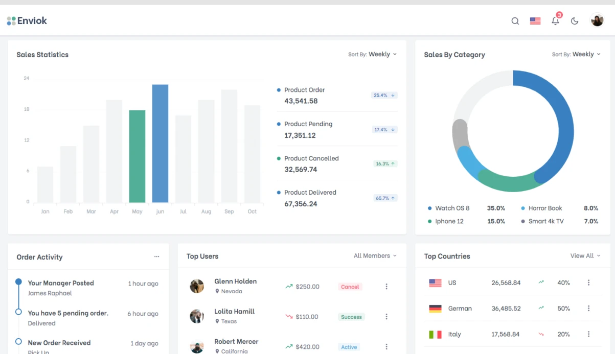
Radial Bar (Circular Progress)
function KPIRadials({ metrics }) {
  const series = [
    metrics.ordersPercent,
    metrics.revenuePercent,
    metrics.npsPercent
  ];

  const options: ApexCharts.ApexOptions = {
    chart: { type: 'radialBar' },
    plotOptions: {
      radialBar: {
        dataLabels: {
          name: { fontSize: '14px' },
          value: { fontSize: '20px', formatter: (val) => `${val}%` },
          total: {
            show: true,
            label: 'Overall Progress',
            formatter: () => `${Math.round(series.reduce((a, b) => a + b, 0) / series.length)}%`
          }
        }
      }
    },
    labels: ['Orders', 'Revenue', 'NPS'],
    colors: ['#3b82f6', '#22c55e', '#f59e0b']
  };

  return <Chart type="radialBar" series={series} options={options} height={280} />;
}
Sparklines
function SparklineCard({ title, value, data, trend }) {
  return (
    <div className="metric-card">
      <div className="flex justify-between items-start">
        <div>
          <p className="text-sm text-gray-500">{title}</p>
          <p className="text-2xl font-bold">{value}</p>
          <span className={trend > 0 ? 'text-green-500' : 'text-red-500'}>
            {trend > 0 ? '↑' : '↓'} {Math.abs(trend)}%
          </span>
        </div>
        <Chart
          type="line"
          series={[{ data }]}
          options={{
            chart: { sparkline: { enabled: true } },
            stroke: { curve: 'smooth', width: 2 },
            colors: [trend > 0 ? '#22c55e' : '#ef4444'],
            tooltip: { enabled: false }
          }}
          height={60}
          width={120}
        />
      </div>
    </div>
  );
}
Timeline
Set of 5–6 chart types for dashboard — 3–4 days.