


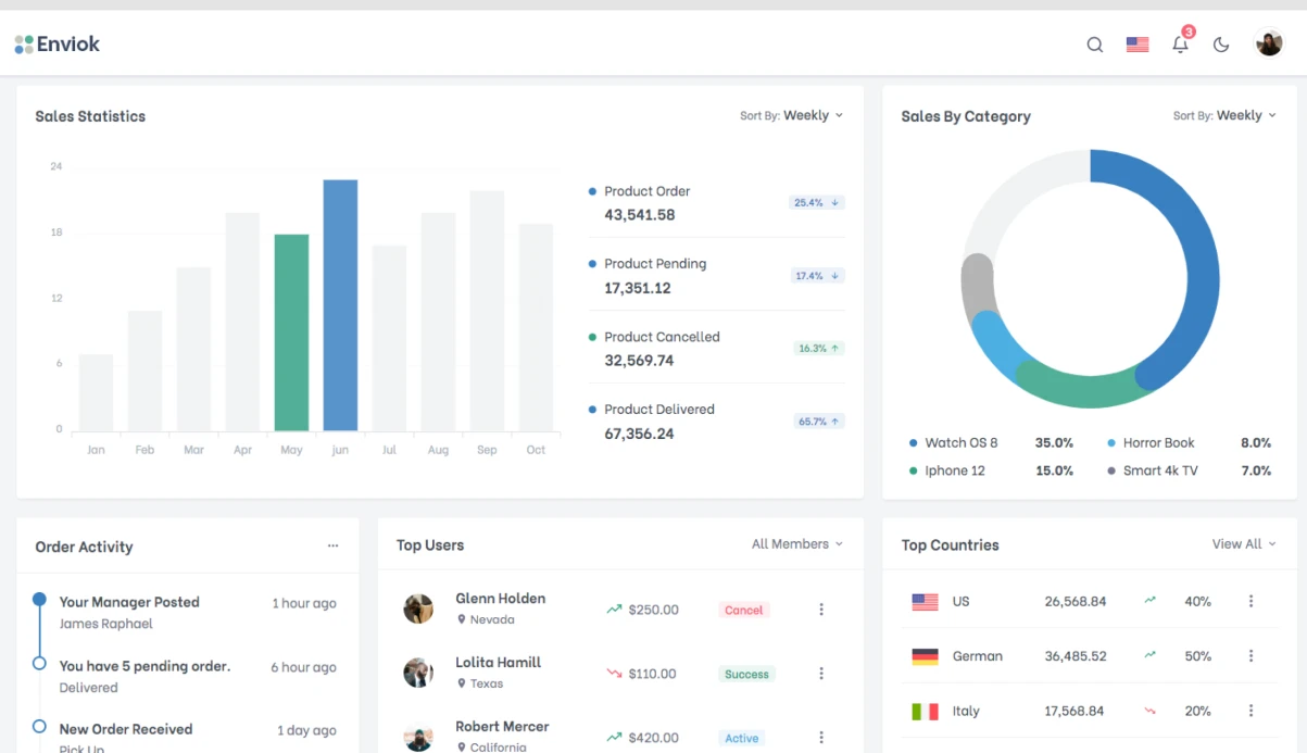
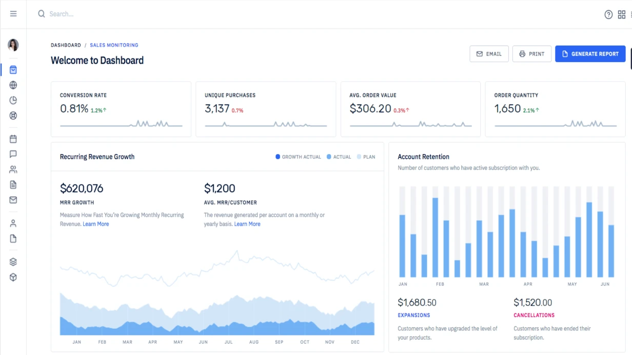


הערה: כאשר אפליקציית React צריכה להציג עשרות אלפי נקודות נתונים, בחירת ספריית תרשימים הופכת קריטית. D3.js נותן שליטה מלאה אך דורש מאות שורות קוד. Chart.js ו-Recharts פשוטות יותר אך מוגבלות בהתאמה אישית. Nivo היא נקודת האיזון המושלמת: גישה מבוססת רכיבי React, תמיכה ב-SVG ו-Canvas, עשרות סוגי תרשימים מובנים הניתנים להתאמה אישית לכל משימה. המהנדסים שלנו משתמשים ב-Nivo בסביבת ייצור כבר למעלה מ-5 שנים, וסיפקו למעלה מ-50 פרויקטים של ויזואליזציית נתונים עבור פינטק, מסחר אלקטרוני ואנליטיקה. החיסכון בפיתוח ויזואליזציה מגיע ל-עד 30% בהשוואה ל-D3, וזמן האינטגרציה מצטמצם פי 2–3. מקור: תיעוד רשמי של Nivo
בעיה אופיינית היא פורמט נתונים שגוי. Nivo מצפה למערך של אובייקטים עם שדות id ו-data. שגיאות אי-התאמה בהידרציה ב-SSR מתרחשות כאשר הנתונים שונים בין הלקוח לשרת. Nivo מציגה כראוי על השרת כל עוד הנתונים מועברים באופן זהה. אנו מבטיחים פעולה יציבה בכל השלבים.
למה Nivo עדיפה על D3 עבור אפליקציות React
D3 עובדת עם ה-DOM ברמה נמוכה, בעוד Nivo מספקת רכיבי React מוכנים. עם D3, עליך לנהל את מחזור החיים, העדכונים וההשמדה של התרשימים בעצמך. Nivo מטפלת בכך: כאשר הנתונים משתנים, פשוט העבר props חדשים, והרכיב מתעדכן עם אנימציה. D3 דורשת קריאות עדכון והסרה ידניות. Nivo גם מציגה על השרת (SSR) באמצעות React, בעוד D3 עובדת בדרך כלל רק על הלקוח. זה קריטי עבור SEO ו-LCP. בנוסף, Nivo מאפשרת מעבר קל בין SVG ל-Canvas: עבור מערכי נתונים גדולים (10,000+ נקודות), השתמש ב-Canvas—ביצועים של 60 fps לעומת 30 fps עבור D3.
איך לשפר את ביצועי התרשימים
כאשר עובדים עם מערכי נתונים גדולים (מעל 5,000 נקודות), אנו ממליצים:
- השתמש ב-
useCanvasבמקום SVG. - בצע memoization לנתונים עם
React.memoאוuseMemo. - הגבל נקודות על המסך באמצעות אגרגציה.
- הגדר
motionConfigכדי להשבית אנימציות.
טכניקות אלו מאיצות את העיבוד פי 2–3 ומפחיתות את עומס המעבד.
השוואת Nivo מול D3
| תכונה | Nivo | D3.js |
|---|---|---|
| רמת הפשטה | גבוהה (רכיבי React) | נמוכה (DOM + SVG) |
| זמן פיתוח לתרשים טיפוסי | 1–2 ימים | 3–5 ימים |
| תמיכה ב-SSR | כן (מובנה) | לא (דורש התאמה אישית) |
| ביצועים על 10k נקודות | 60 fps (Canvas) | 30–40 fps |
| קוד עבור tooltip מותאם אישית | 5–10 שורות | 30+ שורות |
| תכונה | Nivo | Recharts | Chart.js |
|---|---|---|---|
| סוג עיבוד | SVG/Canvas | SVG | Canvas |
| התאמת tooltip | מלאה (רכיבי React) | מוגבלת | מוגבלת |
| תמיכה ב-SSR | כן | כן | לא |
| ביצועים (10k נקודות) | 60fps (Canvas) | 30fps | 45fps |
| סוגי תרשימים | 20+ | 8 | 8 |
במהלך הפיתוח, אנו מתחשבים ב-responsive: התרשימים מתאימים עצמם אוטומטית לגודל המיכל באמצעות רכיבי Responsive של Nivo. זה חשוב במיוחד עבור לוחות מחוונים הנצפים במכשירים שונים. אנו גם מגדירים tooltips כך שיוצגו כראוי על מסכים ניידים.
מה כלול
- קוד מקור של רכיבי תרשימים עם tooltips מותאמים אישית.
- תיעוד על פורמט נתונים ו-props.
- אינטגרציה עם API קיים.
- תמיכה בנייד (responsive).
- הדרכה לצוות (עד שעה).
- אחריות ל-3 חודשים.
טעויות נפוצות וכיצד להימנע מהן
- מבנה נתונים שגוי: ודא שהמערך מכיל אובייקטים עם
id(מחרוזת) ו-data(מערך נקודות). - מפתחות חסרים בעת מיפוי: השתמש ב-
React.memoובמפתח ייחודי. - התעלמות מ-responsive: עטף במיכל עם גובה קבוע (
min-height). - שכחת
useMesh: בלעדיו, tooltips לא יעבדו. - תלויות חסרות:
@nivo/coreנדרש.
תהליך
- ניתוח נתונים ודרישות ויזואליזציה.
- בחירת סוגי תרשימים ואב-טיפוס.
- הגדרת backend להחזרת נתונים בפורמט הנדרש.
- אינטגרציה של רכיבי Nivo, התאמת tooltips ו-legends.
- אופטימיזציית ביצועים (memoization, Canvas לנתונים גדולים).
- בדיקה על מכשירים ניידים ומסכים שונים.
- פריסה וניטור.
לוח זמנים
בין 3 ל-10 ימים בהתאם למורכבות. התמחור הוא אישי.
דוגמאות קוד (הרחב)
התקנה
npm install @nivo/line @nivo/bar @nivo/pie @nivo/heatmap @nivo/core תרשים קווים
import { ResponsiveLine } from '@nivo/line';

function NivoLineChart({ data }) {
  // Nivo ожидает формат: [{ id: 'series', data: [{ x, y }] }]
  const nivoData = [
    {
      id: 'Выручка',
      color: '#3b82f6',
      data: data.map(d => ({ x: d.date, y: d.revenue })),
    },
    {
      id: 'Цель',
      color: '#f59e0b',
      data: data.map(d => ({ x: d.date, y: d.target })),
    },
  ];

  return (
    <div style={{ height: 350 }}>
      <ResponsiveLine
        data={nivoData}
        margin={{ top: 20, right: 120, bottom: 50, left: 70 }}
        xScale={{ type: 'time', format: '%Y-%m-%d', precision: 'day' }}
        xFormat="time:%d.%m.%Y"
        yScale={{ type: 'linear', stacked: false }}
        yFormat=" >-.0f"
        curve="monotoneX"
        axisLeft={{
          format: v => `${(v / 1000).toFixed(0)}k`,
          legend: 'Выручка ($)',
          legendOffset: -60,
          legendPosition: 'middle',
        }}
        axisBottom={{ format: '%d %b', tickValues: 'every 2 weeks' }}
        colors={{ scheme: 'paired' }}
        lineWidth={2}
        pointSize={4}
        enableArea
        areaOpacity={0.1}
        useMesh
        legends={[
          {
            anchor: 'bottom-right',
            direction: 'column',
            itemWidth: 100,
            itemHeight: 20,
          },
        ]}
        tooltip={({ point }) => (
          <div className="chart-tooltip">
            <strong>{point.data.xFormatted}</strong>
            <br />
            {point.serieId}: {Number(point.data.y).toLocaleString('ru')} $
          </div>
        )}
      />
    </div>
  );
}
תרשים עמודות עם צבעים מותאמים לפי ערך
import { ResponsiveBar } from '@nivo/bar';

function ConversionBarChart({ data }) {
  return (
    <div style={{ height: 300 }}>
      <ResponsiveBar
        data={data}
        keys={['conversion']}
        indexBy="page"
        margin={{ top: 10, right: 20, bottom: 60, left: 60 }}
        padding={0.4}
        valueScale={{ type: 'linear' }}
        colors={({ data }) => {
          if (data.conversion >= 5) return '#22c55e';
          if (data.conversion >= 2) return '#f59e0b';
          return '#ef4444';
        }}
        axisBottom={{ tickRotation: -45 }}
        axisLeft={{ format: v => `${v}%` }}
        label={d => `${d.value}%`}
        tooltip={({ data, value }) => (
          <div className="chart-tooltip">
            <strong>{data.page}</strong>: {value}% конверсия
          </div>
        )}
      />
    </div>
  );
}
מפת חום לוח שנה
import { ResponsiveCalendar } from '@nivo/calendar';

function ActivityCalendar({ data }) {
  // data: [{ day: '2024-03-28', value: 42 }]
  return (
    <div style={{ height: 200 }}>
      <ResponsiveCalendar
        data={data}
        from="2024-01-01"
        to="2024-12-31"
        emptyColor="#f3f4f6"
        colors={['#dbeafe', '#93c5fd', '#3b82f6', '#1d4ed8']}
        margin={{ top: 20, right: 20, bottom: 20, left: 20 }}
        yearSpacing={40}
        monthBorderColor="#ffffff"
        dayBorderWidth={2}
        dayBorderColor="#ffffff"
        tooltip={({ day, value }) => (
          <div className="chart-tooltip">{day}: {value} событий</div>
        )}
      />
    </div>
  );
}
הזמן פיתוח turnkey — קבל ייעוץ ואב-טיפוס תוך יומיים. צור קשר כדי לדון בפרויקט שלך. המהנדסים שלנו עם ניסיון של 5+ שנים יעזרו לך ליישם ויזואליזציית נתונים בכל מורכבות.