

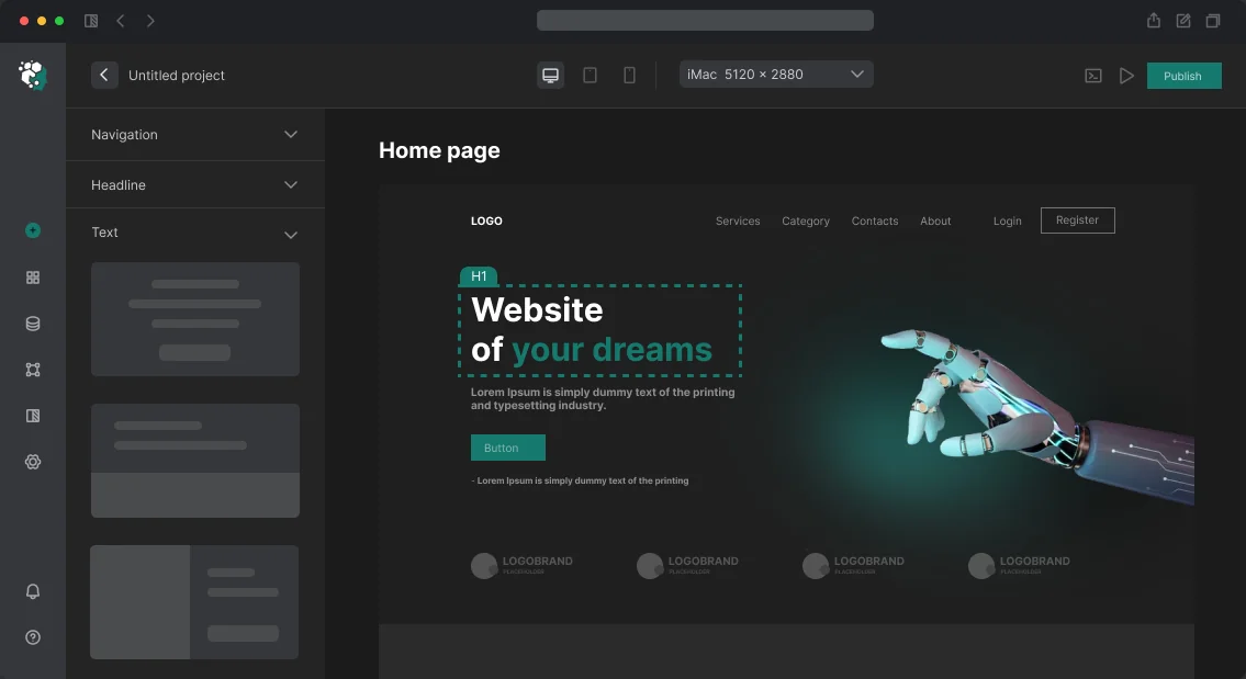





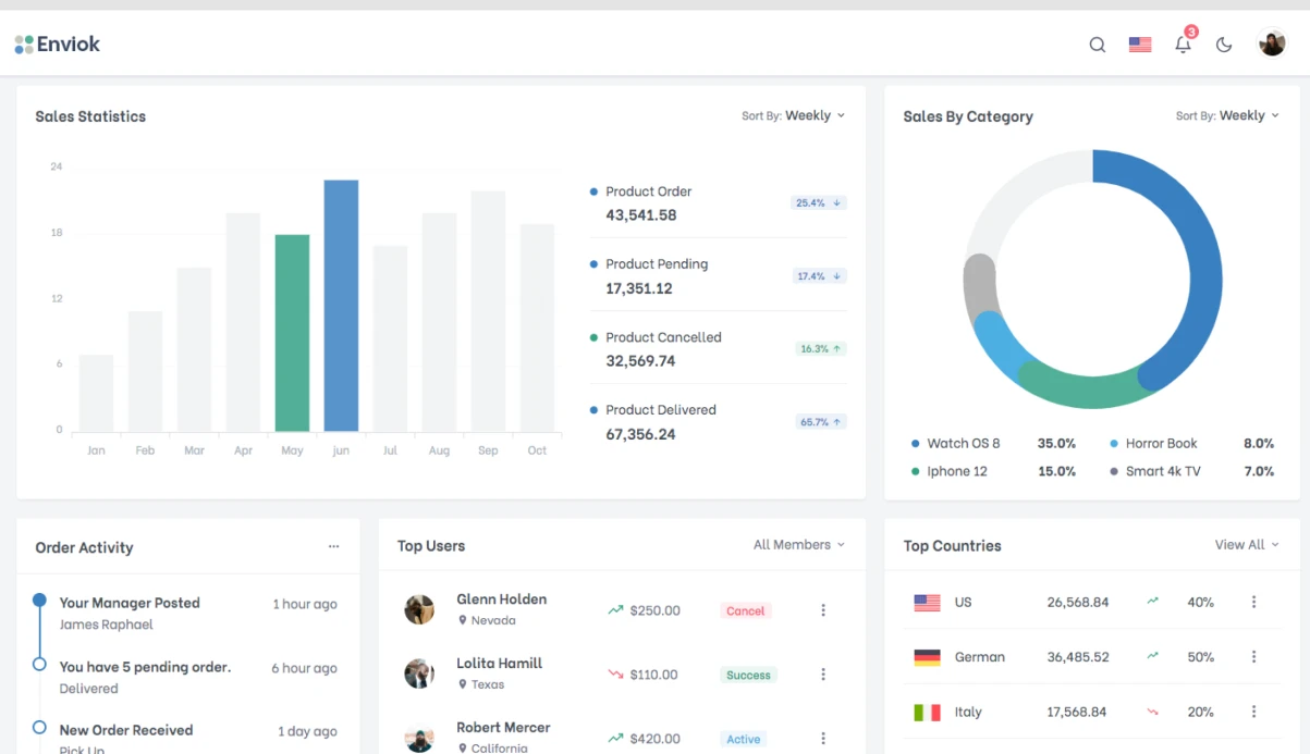

דמיינו אתר מסחר אלקטרוני עם 50,000 מוצרים. כותרת דביקה (sticky header) במהלך גלילה תופסת 10% מהמסך, מחמירה את LCP ב-1.5 שניות ומגדילה את CLS ל-0.25. במובייל, כפתור 'קנייה' מכוסה על ידי ניווט תחתון ללא safe-area. בעיות כאלה נפתרות עם קוד ברמת production שנבדק על אתרים עם 100 אלף+ סשנים ביום. אנחנו, צוות עם ניסיון של 10+ שנים בפיתוח אתרים, יישמנו אלמנטים דביקים ביותר מ-50 פרויקטים. בואו נפרק את היישום של כותרת/פוטר דביקים עם hide-on-scroll, React hook ותמיכה ב-iOS. אם אתם צריכים פתרון מוכן, הזמינו אותו turnkey עם אחריות ל-6 חודשים.
איך עובד position: sticky?
position: sticky הוא כלי בסיסי, אבל יש לו ניואנסים. קונטיינר האב לא צריך להכיל overflow: hidden, אחרת ההדבקה לא תעבוד. הוא לא תומך ב'בריחה' בגלילה למטה ועלול להתנגש עם offsets מותאמים אישית. לתרחישים פשוטים זה בסדר, למורכבים זה לא. לפי MDN, position: sticky הוא הכלאה בין relative ל-fixed.
CSS בסיסי לכותרת דביקה
/* Стили для sticky header */
.site-header {
  position: sticky;
  top: 0;
  z-index: 100;
  background: #fff;
  will-change: transform;
  transition: box-shadow 0.2s ease;
}

.site-header--scrolled {
  box-shadow: 0 2px 20px rgba(0, 0, 0, 0.1);
}

/* Hide-on-scroll: скрытие при прокрутке вниз */
.site-header--hidden {
  transform: translateY(-100%);
  transition: transform 0.3s ease;
}

/* Sticky footer с safe-area */
.bottom-nav {
  position: fixed;
  bottom: 0;
  left: 0;
  right: 0;
  z-index: 100;
  background: #fff;
  border-top: 1px solid #e2e8f0;
  padding-bottom: env(safe-area-inset-bottom);
  padding-bottom: max(env(safe-area-inset-bottom), 8px);
}

/* Sidebar с учётом высоты хедера */
:root {
  --header-height: 64px;
}

.sidebar {
  position: sticky;
  top: calc(var(--header-height) + 24px);
  max-height: calc(100vh - var(--header-height) - 48px);
  overflow-y: auto;
  overscroll-behavior: contain;
}

/* Anchor-ссылки: scroll-margin-top */
[id] {
  scroll-margin-top: calc(var(--header-height, 64px) + 16px);
}
למה transform יעיל יותר ל-hide-on-scroll?
שינוי /* Стили для sticky header */ .site-header { position: sticky; top: 0; z-index: 100; background: #fff; will-change: transform; transition: box-shadow 0.2s ease; } .site-header--scrolled { box-shadow: 0 2px 20px rgba(0, 0, 0, 0.1); } /* Hide-on-scroll: скрытие при прокрутке вниз */ .site-header--hidden { transform: translateY(-100%); transition: transform 0.3s ease; } /* Sticky footer с safe-area */ .bottom-nav { position: fixed; bottom: 0; left: 0; right: 0; z-index: 100; background: #fff; border-top: 1px solid #e2e8f0; padding-bottom: env(safe-area-inset-bottom); padding-bottom: max(env(safe-area-inset-bottom), 8px); } /* Sidebar с учётом высоты хедера */ :root { --header-height: 64px; } .sidebar { position: sticky; top: calc(var(--header-height) + 24px); max-height: calc(100vh - var(--header-height) - 48px); overflow-y: auto; overscroll-behavior: contain; } /* Anchor-ссылки: scroll-margin-top */ [id] { scroll-margin-top: calc(var(--header-height, 64px) + 16px); } לא גורם ל-reflow — הדפדפן מעבד אותו על GPU. זה מהיר פי 10+ משינוי transform או top. דפוס ה-hide-on-scroll: הסתר כותרת בגלילה למטה, הצג בגלילה למעלה. השתמשו ב-throttling דרך height כדי למזער עומס. יישום טיפוסי ב-JavaScript טבעי:
const header = document.querySelector('.site-header');
let lastScrollY = 0;
let scrollStart = 0;
let hidden = false;
const THRESHOLD = 100;
const HIDE_AFTER = 50;

function onScroll() {
    const y = window.scrollY;
    const diff = y - lastScrollY;
    if (diff > 0) {
        if (!hidden && y > THRESHOLD && y - scrollStart > HIDE_AFTER) {
            header.classList.add('site-header--hidden');
            hidden = true;
        }
    } else {
        if (hidden) {
            header.classList.remove('site-header--hidden');
            hidden = false;
            scrollStart = y;
        }
    }
    lastScrollY = y;
}

let ticking = false;
window.addEventListener('scroll', () => {
    if (!ticking) {
        requestAnimationFrame(() => {
            onScroll();
            ticking = false;
        });
        ticking = true;
    }
}, { passive: true });
איך ליישם hide-on-scroll עם React hook?
ב-React 18+ אנחנו משתמשים ב-hook מותאם אישית שמחזיר מצבים requestAnimationFrame ו-const header = document.querySelector('.site-header'); let lastScrollY = 0; let scrollStart = 0; let hidden = false; const THRESHOLD = 100; const HIDE_AFTER = 50; function onScroll() { const y = window.scrollY; const diff = y - lastScrollY; if (diff > 0) { if (!hidden && y > THRESHOLD && y - scrollStart > HIDE_AFTER) { header.classList.add('site-header--hidden'); hidden = true; } } else { if (hidden) { header.classList.remove('site-header--hidden'); hidden = false; scrollStart = y; } } lastScrollY = y; } let ticking = false; window.addEventListener('scroll', () => { if (!ticking) { requestAnimationFrame(() => { onScroll(); ticking = false; }); ticking = true; } }, { passive: true }); . זה מפחית re-renders פי 3–5 בהשוואה למניפולציה ישירה של DOM. הנה ה-hook המלא ודוגמת קומפוננטה:
import { useState, useEffect, useRef } from 'react';

interface StickyHeaderState {
  isScrolled: boolean;
  isVisible: boolean;
  scrollY: number;
}

function useStickyHeader(hideOnScrollDown = true): StickyHeaderState {
  const [state, setState] = useState<StickyHeaderState>({
    isScrolled: false,
    isVisible: true,
    scrollY: 0
  });
  const lastScrollY = useRef(0);
  const scrollStart = useRef(0);

  useEffect(() => {
    let ticking = false;
    const handler = () => {
      if (ticking) return;
      ticking = true;
      requestAnimationFrame(() => {
        const y = window.scrollY;
        const diff = y - lastScrollY.current;
        setState(prev => {
          let isVisible = prev.isVisible;
          if (hideOnScrollDown) {
            if (diff > 0 && y > 100 && y - scrollStart.current > 50) {
              isVisible = false;
            } else if (diff < 0) {
              if (!isVisible) scrollStart.current = y;
              isVisible = true;
            }
          }
          return {
            isScrolled: y > 10,
            isVisible,
            scrollY: y
          };
        });
        lastScrollY.current = y;
        ticking = false;
      });
    };
    window.addEventListener('scroll', handler, { passive: true });
    return () => window.removeEventListener('scroll', handler);
  }, [hideOnScrollDown]);

  return state;
}

export function SiteHeader() {
  const { isScrolled, isVisible } = useStickyHeader(true);
  return (
    <header
      className={[
        'site-header',
        isScrolled ? 'site-header--scrolled' : '',
        !isVisible ? 'site-header--hidden' : '',
      ]
        .filter(Boolean)
        .join(' ')}
    >
      {/* контент */}
    </header>
  );
}
איך למנוע חפיפה של תוכן על ידי כותרת דביקה עם קישורי עוגן?
הוסיפו מאפיין CSS isScrolled לכל האלמנטים עם id: isVisible. או השתמשו ב-JS לחישוב offset ו-import { useState, useEffect, useRef } from 'react'; interface StickyHeaderState { isScrolled: boolean; isVisible: boolean; scrollY: number; } function useStickyHeader(hideOnScrollDown = true): StickyHeaderState { const [state, setState] = useState<StickyHeaderState>({ isScrolled: false, isVisible: true, scrollY: 0 }); const lastScrollY = useRef(0); const scrollStart = useRef(0); useEffect(() => { let ticking = false; const handler = () => { if (ticking) return; ticking = true; requestAnimationFrame(() => { const y = window.scrollY; const diff = y - lastScrollY.current; setState(prev => { let isVisible = prev.isVisible; if (hideOnScrollDown) { if (diff > 0 && y > 100 && y - scrollStart.current > 50) { isVisible = false; } else if (diff < 0) { if (!isVisible) scrollStart.current = y; isVisible = true; } } return { isScrolled: y > 10, isVisible, scrollY: y }; }); lastScrollY.current = y; ticking = false; }); }; window.addEventListener('scroll', handler, { passive: true }); return () => window.removeEventListener('scroll', handler); }, [hideOnScrollDown]); return state; } export function SiteHeader() { const { isScrolled, isVisible } = useStickyHeader(true); return ( <header className={[ 'site-header', isScrolled ? 'site-header--scrolled' : '', !isVisible ? 'site-header--hidden' : '', ].filter(Boolean).join(' ')} > {/* контент */} </header> ); } ידני בלחיצה על קישורי עוגן. בלי זה, עוגנים יוסתרו מתחת לכותרת, מה שיחמיר את חוויית המשתמש.
מה זה safe-area-inset-bottom ואיך להשתמש בו?
לניווט תחתון במובייל השתמשו ב-scroll-margin-top עם scroll-margin-top: calc(var(--header-height) + 16px). ב-scrollTo הוסיפו position: fixed. פצו על הגובה בתוכן: env(safe-area-inset-bottom). זה מונע מתוכן להיות מכוסה על ידי פאנלים מערכתיים של iOS.
מה כלול בעבודה?
- ביקורת על היישום הנוכחי של אלמנטים דביקים עם מדידת Core Web Vitals.
- פיתוח פתרון מותאם אישית על הסטאק שלכם (React, Vue, Angular, או JS טבעי).
- אינטגרציה עם הארכיטקטורה הקיימת, כולל SSR והגנת CSRF.
- אופטימיזציית ביצועים: ביטול layout thrashing, מזעור reflow.
- בדיקות על מכשירים אמיתיים (iPhone, Android, iPad) עם גרסאות דפדפן שונות.
- תיעוד והדרכה למפתח שלכם.
- תמיכה לאחר השקה למשך 6 חודשים.
תמיכת דפדפנים
אלמנטים דביקים נתמכים בכל הדפדפנים המודרניים (Chrome 56+, Firefox 59+, Safari 8+, Edge 16+). עבור IE11 נדרש polyfill. Safe-area נתמך ב-Safari החל מ-iOS 11.השוואת גישות: sticky לעומת fixed
| פרמטר | position: sticky | position: fixed |
|---|---|---|
| בזרימה | כן | לא |
| תופס מקום | כן | לא |
| הידבקות בגלילה | כל כיוון | מיקום קבוע |
| ביצועים | גבוהים | גבוהים |
| תמיכה ב-hide-on-scroll | נדרש JS | נדרש JS |
טעויות נפוצות ביישום אלמנטים דביקים
| בעיה | פתרון |
|---|---|
לקונטיינר האב יש <head> |
הסירו <meta name="viewport" content="width=device-width, initial-scale=1, viewport-fit=cover"> או שנו את המבנה |
padding-bottom: calc(60px + env(safe-area-inset-bottom)) לא מוגדר |
הגדירו overflow: hidden לאלמנט הדביק |
חסר overflow: hidden |
הוסיפו z-index לביצועים |
אין z-index: 100 במובייל |
השתמשו ב-will-change: transform בפוטר |
קישורי עוגן ללא will-change: transform |
הוסיפו safe-area-inset-bottom לכל האלמנטים עם id |
שימוש ב-env(safe-area-inset-bottom) או scroll-margin-top לאנימציית הסתרה |
השתמשו ב-scroll-margin-top |
תהליך עבודה
- אנליטיקה — ביקורת על ההתנהגות הנוכחית ו-Core Web Vitals. מדידת LCP, CLS, INP.
- עיצוב — בחירת גישה (sticky/hide-on-scroll), שיקול mobile-first.
- יישום — כתיבת קוד עם אינטגרציה לפרויקט שלכם. שימוש בסטאק מודרני (React 18, TypeScript, CSS Modules).
- בדיקות — בדיקה על מכשירים אמיתיים (iPhone, Android, iPad), מדידת מדדים.
- השקה — מסירת קוד, תיעוד, הדרכת המפתח שלכם.
לוח זמנים ועלות
לוח זמנים ליישום — מ-3 עד 7 ימי עבודה תלוי במורכבות. העלות מחושבת באופן אישי. אתם חוסכים על תיקון שגיאות שהיו מתרחשות ביישום עצמי. צרו קשר להערכת פרויקט — קבלו ייעוץ וחישוב מקדים תוך יום אחד. הזמינו יישום אלמנטים דביקים turnkey עם אחריות ל-6 חודשים.