

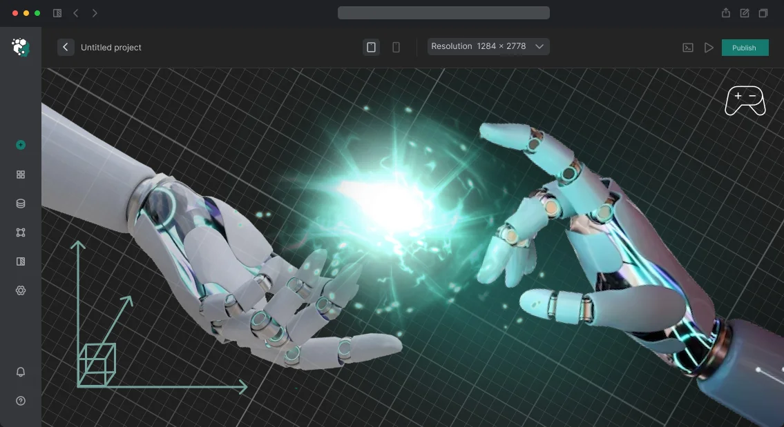
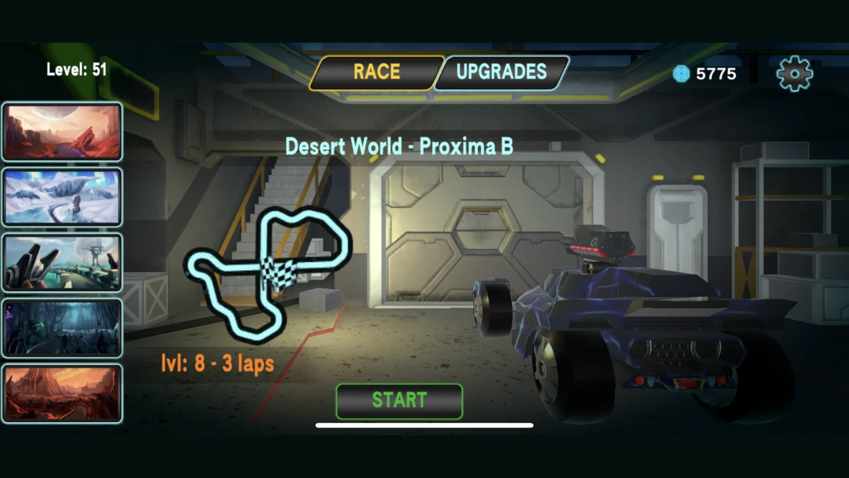

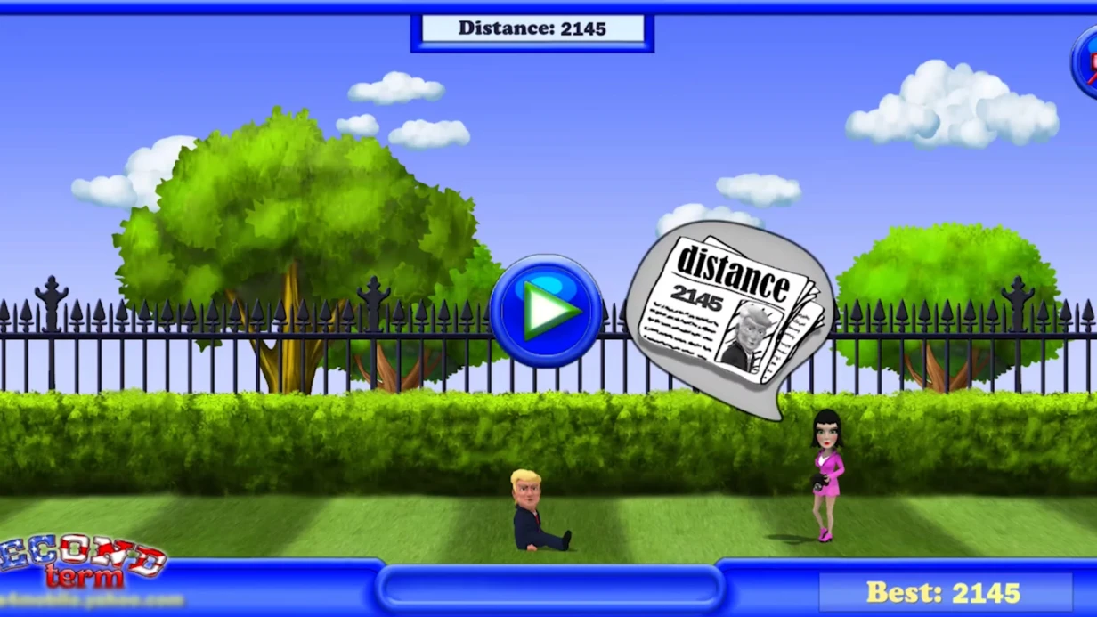
ב-RPG, אייקון חרב מצויר בצורה גרועה שובר את חוויית המשחק — השחקן רואה אותו מאות פעמים בכל סשן. ממשק משתמש באיכות נמוכה הורג את החווייה. לכן, עיבוד אלמנטים דו-ממדיים למשחקים הוא משימה הנדסית: להתאים לאילוצים הטכניים של המנוע, לפורמטים, לרזולוציות, ולשמור על קריאות בכל מסך.
לצוות שלנו יש ניסיון של 8+ שנים בגרפיקת ממשק משתמש למשחקים, והשלמנו מעל 50 פרויקטים למובייל, PC וקונסולות. אריזת אטלסים מפחיתה קריאות draw calls פי 10 בהשוואה לטקסטורות בודדות — כל אטלס שווה ל-batch אחד.
למה לתכנן אטלסים לפני העיבוד?
אטלס ספרייטים הוא הכלי הבסיסי לאריזת גרפיקת ממשק משתמש ב-Unity. כל האייקונים ואלמנטי הממשק נארזים לתוך אטלס אחד או כמה כדי למזער קריאות draw calls בעת עיבוד ה-Canvas. אטלס אחד = batch אחד. אם אייקונים מפוזרים על פני טקסטורות בודדות, כל אייקון על המסך הופך לקריאת draw call נפרדת.
זה מטיל מגבלות על גודל וכמות האטלסים: בדרך כלל 2048×2048 פיקסלים מקסימום למובייל, 4096×4096 ל-PC. כל ממשק המשתמש של מסך אחד נכנס לאטלס אחד. כלומר, המעצב חייב לדעת מראש: האם כל אייקוני המלאי נכנסים ל-2048×2048? ב-64×64 פיקסלים לאייקון — 1024 אייקונים. ב-128×128 — 256. תכנון האטלס מתחיל בשלב כתיבת המפרט הטכני, לא אחרי העיבוד הסופי.
פורמטי ייצוא: PNG ללא דחיסה למקורות; בתוך Unity, הטקסטורות מומרות בהתאם לפלטפורמה. לפי תיעוד Unity, אנו משתמשים ב-ETC2 לאנדרואיד, ASTC ל-iOS, ו-DXT5 ל-PC. ערוץ אלפא — PNG נפרד או דרך RGBA בקובץ אחד, בהתאם להגדרות הפרויקט. שקיפות דרך ערוץ מסכה נפרד לפעמים נותנת איכות טובה יותר תחת דחיסה.
| פורמט | פלטפורמה | הערה |
|---|---|---|
| ETC2 | אנדרואיד | מתאים לרוב המכשירים |
| ASTC | iOS | האיכות הטובה ביותר תחת דחיסה |
| DXT5 | PC | תומך בערוץ אלפא |
שכבות ו-overrides ב-Figma הם הסטנדרט להכנת גרפיקת ממשק משתמש. כל אלמנט הוא רכיב נפרד עם וריאנטים של מצבים (רגיל, hover, לחוץ, מנוטרל). בייצוא הסופי, כל הווריאנטים נחתכים אוטומטית דרך פלאגינים של Figma כמו Spriter Pro או ידנית דרך Assets → Export.
איך להבטיח קריאות אייקון על כל רקע?
יש לבדוק אייקון לא רק על רקע אפור נייטרלי ב-Figma. במשחק, הוא מופיע על רקע פאנל מלאי, על סצנה דינמית דרך HUD שקוף למחצה, על וריאנטים כהים ובהירים אם המשחק תומך במספר ערכות צבע. אייקון שנקרא בצורה מושלמת על רקע כהה יכול ללכת לאיבוד לגמרי על רקע בהיר.
טכניקה סטנדרטית היא קו מתאר עם צבע מנוגד. לאייקונים כהים — קו מתאר בהיר של 1–2 פיקסלים. לאייקונים בהירים — קו מתאר כהה. עם זאת, שימוש ברכיב Outline הסטנדרטי ב-uGUI יוצר עותקי mesh נוספים ועובד בצורה גרועה עם TextMeshPro. לאייקונים, עדיף לאפות את קו המתאר ישירות לתוך הטקסטורה או להשתמש בגישת SDF דרך ShaderGraph: האייקון מעובד כטקסטורת SDF, וקו המתאר מתווסף דרך פרמטר shader ללא שינוי ה-mesh.
טכניקה נוספת היא צל נמוך מתחת לאייקון. צל רך בקוטר 4–6 פיקסלים מפריד את האייקון מכל רקע. זו אחת השיטות האמינות ביותר לממשק משתמש עם רקע דינמי (כאשר אייקוני HUD מונחים על סביבת המשחק).
עיבוד ב-Figma לעומת מסך במשחק — ההבדל יכול להגיע עד 30% אובדן ניגודיות בגלל אפקטים פוסט-עיבוד של המנוע. הניסיון שלנו מראה שהדרך הטובה ביותר היא לבדוק על הפלטפורמה היעד עם הגדרות מצלמה אמיתיות.
מה כולל עיבוד אלמנטי ממשק משתמש?
אייקונים — הסוג הכי עתיר עבודה. משחקי RPG כוללים לעתים קרובות 200–500+ אייקוני פריטים. תהליך סטנדרטי: מדריך סגנון עם 10–20 אייקוני ייחוס → אישור → עיבוד בכמות לפי תבנית. כל אייקון בכמות לוקח 30–60 דקות, אייקון "תצוגה" ייחודי לוקח 2–4 שעות.
מסגרות ופאנלים — גבולות דקורטיביים לחלונות, דיאלוגים, מלאי. קריטי: תמיכה ב-9-slice (NineSlicedSprite ב-Unity): המסגרת חייבת להתקנה נכון בלי למתוח אלמנטים דקורטיביים בפינות. בעת העיבוד, הפינות והקצוות חייבים לתפוס בדיוק את מספר הפיקסלים הנדרש לכלל ה-9-slice — זה מתועד בחומרי המסירה.
אלמנטי HUD — פס חיים, פס מאנה, טיימרים, סמנים. קריאות במהלך אנימציה היא קריטית: פס חיים שמתמלא חייב להיות גלוי גם בתנועה מהירה. אנו בודקים ברזולוציה האמיתית של הפלטפורמה היעד, לא בתצוגה המקדימה של Figma.
כפתורים ואלמנטי ניווט — כל המצבים (רגיל/hover/לחוץ/מנוטרל/ממוקד לגיימפאד). המצב הממוקד נשכח לעתים קרובות בעת עיבוד למובייל ונזכר רק כשמעבירים לקונסולה.
מקרה: עיצוב מחדש של מלאי עם 300 אייקונים
מהניסיון שלנו: בפרויקט אחד, עיצבנו מחדש את מערכת הפריטים ל-action-RPG — שינוי הסגנון הוויזואלי מריאליסטי לסטייליזציה. 312 אייקונים, דדליין של 6 שבועות. פתרון דרך תבניות: פיתחנו 8 צורות בסיס של צלליות (חרב, מגן, קשת, שיקוי, שריון, אביזר, משאב, פריט משימה) ומדריך סגנון עם כללים ליישום צבע, הדגשות וצללים. כל אייקון נבנה על צללית בסיס עם וריאציות בפרטים. זה הפחית את זמן העיבוד הממוצע מ-45 ל-25 דקות תוך שמירה על אחידות סגנונית.
אינטראקציה עם מתכנתים ואמנים
גרפיקת ממשק משתמש נעשית תמיד בקשר הדוק עם המתכנת שמיישם את הממשק. לפני ההתחלה, אנו מסכמים: גדלי אטלסים, מוסכמות שמות קבצים (לאריזת Sprite Atlas אוטומטית), האם יש צורך בתמיכה במספר רזולוציות (x1/x2/x3), ופורמט מסירת המקורות.
שינויים בגדלים או בצורות של אלמנטים אחרי שההטמעה החלה הם יקרים לתיקון. לכן, מסמך המפרט הסופי (מידות פיקסלים, כללי 9-slice, קודי צבע) מאושר לפני הייצוא, לא אחריו.
שלבי עבודה לגרפיקת ממשק משתמש
- ניתוח דרישות — קביעת פלטפורמות, סגנון, מספר אלמנטים.
- יצירת מדריך סגנון — 10–20 אייקוני ייחוס.
- עיבוד אלמנטים לפי התהליך המאושר.
- בדיקה בתוך המנוע — בדיקת קריאות, 9-slice, אנימציות.
- אריזה לאטלסים ומסירה למתכנת.
| היקף | לוח זמנים |
|---|---|
| 20–50 אייקונים (עיבוד בכמות לפי סגנון) | 1–2 שבועות |
| ערכת ממשק מלאה: כפתורים, מסגרות, אייקונים (עד 100 אלמנטים) | 3–5 שבועות |
| 200–400 אייקוני פריטים | 6–12 שבועות |
| עיצוב מחדש של ממשק קיים עם סגנון חדש | 4–8 שבועות |
העלות מחושבת באופן אישי לפי מספר האלמנטים, הייחודיות של כל אחד ודרישות האיכות. אנו מבטיחים אחידות סגנונית וקריאות על כל מסך. צרו קשר להערכת פרויקט — נמצא את התהליך האופטימלי לתקציב וללוח הזמנים שלכם. קבלו ייעוץ על ממשק המשתמש שלכם כבר עכשיו.