

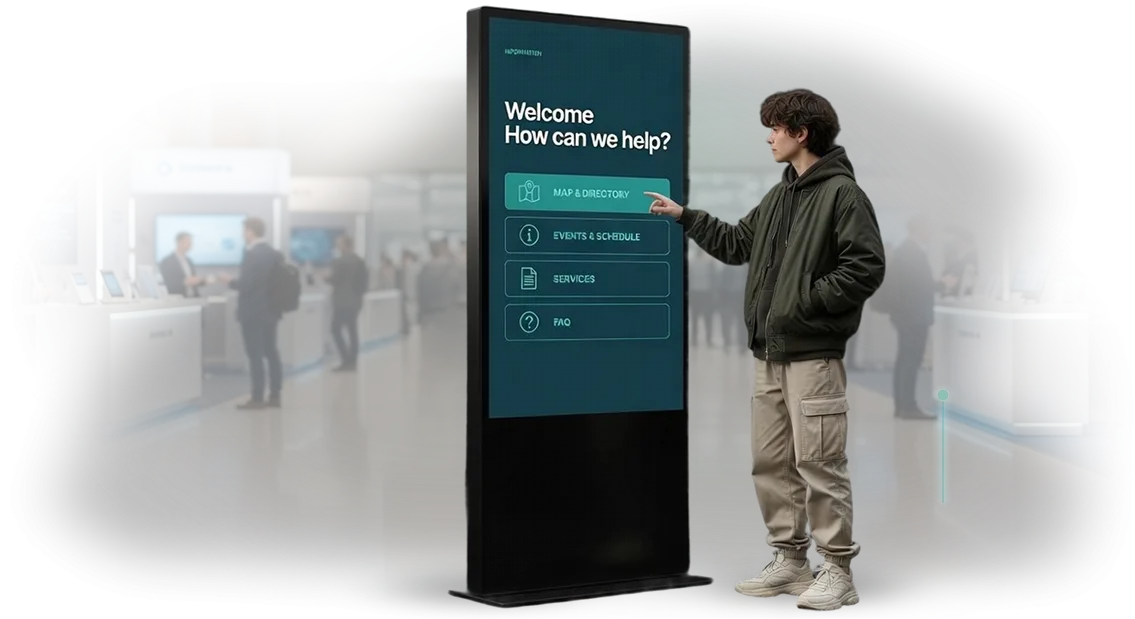
קיוסק בסגנון היי-טק: מדוע אורחים עוזבים בלי לקנות
מבקר ניגש לקיוסק, רואה מסך עמוס מדי, ותוך שניות ספורות מחליט שאין לו זמן להתעסק עם זה. הוא עוזב — ואיתו הולכת גם המכירה שאתם כבר שילמתם עליה בשכירות, בציוד ובתעבורה. העובדים meanwhile נקרעים בין האולם לבין אין-ספור בקשות העזרה "איפה ללחוץ", במקום למכור.
שורש הבעיה כמעט תמיד אינו בחומרה, אלא בממשק של הקיוסק המגע. כשהמסך נראה כמו לוח בקרה של חללית, המבקר הולך לאיבוד: יותר מדי כפתורים, ניסוחים לא ברורים, אזורי נגיעה קטנים. האדם אינו חייב ללמוד — הוא אמור להבין באופן אינטואיטיבי את הצעד הראשון. אם זה לא קורה, הקיוסק הופך למסך יקר שפשוט חולפים על פניו.
סגנון היי-טק אינו עניין של "למלא את המסך באפקטים". מדובר בתחושה של מכשיר מודרני וחכם, שנעים וקל לתקשר איתו: מבנה נקי, פעולות גדולות וברורות, תגובה מיידית למגע, אנימציה מדויקת שמובילה ולא מסיחה את הדעת. ממשק כזה נקרא במבט ראשון ומעורר אמון — ואמון מתורגם ישירות לפעולות שהושלמו.
אנחנו סוגרים את המשימה הזו: מתכננים ממשקים לקיוסקים למגע, שבהם נתיב המבקר ברור והתרחישים מחושבים היטב למצבים אמיתיים באולם. כתוצאה מכך פוחתת אובדן הלקוחות, עולה שיעור אלה שמגיעים ליעד, ופוחת העומס על הצוות — העובדים מפסיקים להיות הוראות הפעלה חיות למסך.
מה העסק מקבל מממשק קיוסק מהונדס היטב
ממשק קיוסק מהונדס היטב הוא לא קישוט, אלא כלי עבודה שמשפיע ישירות על ההכנסות של הנקודה. כאשר מבקר מוצא את מבוקשו במספר נגיעות ומבצע הזמנה בעצמו, שיעור הרכישות העצמאיות עולה, והעובדים מפסיקים להיות "משרד מידע" ועוסקים במה שבאמת דורש אדם. בסגנון עתיר טכנולוגיה הממשק נראה מודרני ומעורר אמון — ואמון מתגלגל ישירות למוכנות לבצע רכישה.
תורים הם אחת הסיבות העיקריות לכך שלקוחות עוזבים מבלי להמתין לשירות. קיוסק עם תרחיש ברור מפחית את העומס: חלק מהמבקרים משרתים את עצמם, מבלי לעמוד בתור המשותף. זה מקצר באופן ניכר את זמן ההמתנה ומפחית את העומס על הצוות בשעות שיא, כאשר כל דקה חשובה.
ממשק מהונדס היטב מוביל את האדם בעדינות לפריטים נוספים — מציע מוצרים נלווים, שירותים או שדרוגים ברגע הנכון. כך הסל הממוצע גדל ללא לחץ על הלקוח וללא מאמץ נוסף מצד העובדים. וסגנון חזותי אחיד בכל המסכים פועל לטובת הכרת המותג: המבקר זוכר כיצד נראית ומרגישה האינטראקציה עם הנקודה שלכם.
יתרון נפרד — יכולת ניהול. משנים את המגוון, המבצעים או ההצעות העונתיות, והקיוסקים מתעדכנים באופן מרוכז, ללא הכשרה מחדש של הצוות וללא הדפסה מחדש של חומרים. העסק מקבל כלי שמתרחב לנקודות ולפורמטים חדשים, תוך שמירה על חוויה מזוהה ונוחה לכל מבקר.
פורמטים של קיוסקים למשימה של המתקן שלכם
פורמט הקיוסק קובע לא רק את המראה של האזור, אלא גם את האופן שבו המבקר מתקשר איתו.
קיוסק רצפתי מקבל את פני האורח בכניסה ועובד כנקודת משיכה עצמאית, קיוסק קירותי חוסך שטח במעברים צרים ובעמדות קבלה, קיוסק משולב משתלב ברהיטים קיימים או בקיר ואינו מתחרה בעיצוב החלל, ועמדה ניידת עוברת בקלות בין אולמות ואירועים. אנו מתאימים את הפורמט לתרחיש של המתקן, ולא להפך.
| פורמט | עבור מי | מה נותן לעסק |
|---|---|---|
| קיוסק רצפתי | מרכזי קניות, מוזיאונים, אולמות תצוגה, בנקים | נקודת כניסה בולטת, מפחית עומס מיועצים, מחזיק זרימת מבקרים ללא תורים |
| קיוסק קירותי | מרפאות, משרדים, מלונות, נקודות איסוף | חוסך שטח, משתלב באסתטיקה של החלל, משרת את המבקר באופן ממוקד |
| קיוסק משולב | שואורומים, מסעדות, חללים יוקרתיים | שומר על שלמות העיצוב, פועל כחלק מהריהוט, אינו תופס מקום מיותר |
| עמדה ניידת | כנסים, מצגות, מבצעים עונתיים | מועברת במהירות בהתאם לאירוע, מרחיבה כיסוי ללא התקנה קבועה |
כיצד לבחור פורמט
אנו בוחנים את התנועה, השטח והמשימה: היכן המבקר מתעכב, כמה זמן יש לו, האם הוא זקוק למדריך או לתרחיש עצמאי. אם האזור צר — נציע אפשרות קירותית או משולבת, אם נדרשת גמישות לאירועים — עמדה ניידת. לעיתים קרובות במתקן משלבים שניים-שלושה פורמטים: אחד מקבל את הזרימה, השני משרת באופן ממוקד.
מה זה נותן ללקוח
כל פורמט סוגר את המשימה שלו: במקום מסוים חשובה הבולטות, במקום אחר — חיסכון במטר, ובמקום נוסף — ניידות עונתית. אנו מתאימים פתרון לפריסה ולתרחיש, כדי שהקיוסק יעבוד לתוצאה, ולא יתפוס מקום. בהמשך — נדון במשימה ונחזור עם הערכה ותוכנית למתקן שלכם.
איך עובר הפרויקט: ממשימה ועד קיוסק פעיל
פרויקט קיוסק הוא לא "לצייר מסכים יפים", אלא להביא את המכשיר למצב שבו הוא עובד באופן יציב ללא מעורבותכם: בלובי, בתערוכה, באולם המכירות. לכן אנחנו מובילים את הלקוח בשלבים ברורים עם נקודות אישור קבועות — אתם תמיד רואים מה קורה ומה יהיה הלאה.
איך בנוי התהליך
- תדריך ומטרות. מפרקים את המשימה: מי המבקרים שלכם, מה הם אמורים לקבל מהקיוסק, אילו פעולות נחשבות להצלחה — בקשה, ניווט, צפייה בקטלוג. בתום השלב — תיאור קצר של תרחישים ששני הצדדים מסכימים עליו.
- אב טיפוס של הקיוסק. בונים את ההיגיון של המסכים והמעברים: איך המבקר מתחיל, לאן הוא הולך, היכן הוא עלול להתבלבל. את האב טיפוס מאשרים לפני הציור — תיקונים בשלב הזה הם הזולים ביותר.
- עיצוב הממשק. מציירים את המסכים בסגנון עתיר-טכנולוגיה: אלמנטים גדולים לאצבע, כיתובים קריאים, אנימציה מדויקת. אישור העיצוב מתבצע על פי מוקאפים, ולא "במילים".
- הרכבה ומילוי תוכן. מעבירים את המוקאפים לאפליקציה עובדת, מחברים את התוכן שלכם — קטלוג, מפה, לוח זמנים, אינטגרציות עם מערכות פנימיות.
- בדיקות על המכשיר האמיתי. בודקים על אותו מסך ובאותם תנאים שבהם הקיוסק יעמוד: תאורה, אצבע, כפפות, עבודה ממושכת ללא אתחול.
- הפעלת הקיוסק. מתקינים, מגדירים, מלמדים את הצוות שלכם את הפעולות הבסיסיות. נוכחים בהתחלה כדי להסיר את השאלות הראשונות.
- תמיכה. לאחר ההפעלה נשארים בקשר: עדכוני תוכן, שיפורים, תגובה לפניות. רוב הלקוחות חוזרים עם נקודות חדשות ותרחישים חדשים.
מה זה נותן ללקוח
אתם מקבלים לוח זמנים צפוי ונקודות בקרה ברורות במקום "קופסה שחורה". כל שלב מסתיים בתוצאה שאפשר לראות ולאשר — אב טיפוס, מוקאפים, מכשיר עובד. אם במהלך הדרך המשימה משתנה, אנחנו אומרים בכנות איך זה ישפיע על לוחות הזמנים, ולא דוחים בשקט.
מה ייכלל באספקה: חבילה ללקוח
הלקוח מקבל לא אוסף קבצים, אלא מוצר מוכן להפעלה: ממשק שכבר נבדק בתרחישים אמיתיים, ותיעוד ברור לצוות. להלן מה בדיוק נכלל באספקת הקיוסק ולמה כל סעיף נחוץ לכם, ולא למפתח.
- עיצובי מסכים לכל המסכים — מראה חיצוני מוסכם בסגנון עתיר טכנולוגיה: מסך פתיחה, ניווט, כרטיסי שירותים, מסכי המתנה וסיום. אתם רואים את המראה הסופי לפני תחילת הבנייה ומכניסים תיקונים בשלב שבו זה לא עולה דבר.
- אב טיפוס אינטראקטיבי — גרסה לחיצה של הממשק, שאפשר "לתקוע" בה אצבע על הטאבלט. מאפשר לבדוק את הלוגיקה לפני תחילת הפיתוח ולהראות להנהלה תוצאה, ולא תיאור.
- ממשק קיוסק מוכן — פתרון בנוי ומוגדר לתרחיש שלכם: תפריט, חיפוש, מדורים, טפסי משוב, אינטגרציה עם הנתונים שלכם. עובד על מסך מגע ללא השהיות ו"תקיעות".
- הוראות הפעלה — מסמך ברור למנהל: כיצד לעדכן תוכן, להפעיל מחדש את הקיוסק בעת תקלה, להוסיף מדור חדש. בלי להזמין מהנדס בכל עניין.
- הדרכת צוות — מקיימים שיעור עם הצוות שלכם: מראים כיצד לנהל תוכן ומה לעשות במצב לא שגרתי. העובדים יוצאים למשמרת בטוחים, ולא "בשיטת הניסוי והטעייה".
- אחריות ותמיכה — קובעים את תקופת האחריות על הממשק ומלווים את ההפעלה: עוזרים בשלב השבועות הראשונים של העבודה, כאשר מתגלים תרחישים אמיתיים של מבקרים.
- העברת זכויות וקוד מקור — כל החומרים נשארים אצלכם. אתם לא קשורים אלינו ויכולים לפתח את הקיוסק בכוחות עצמכם או עם צוות אחר.
חבילה כזו סוגרת את הסיכון העיקרי של הפרויקט: הקיוסק מופעל לא "איך שיצא", אלא כפי שתוכנן, והצוות שלכם יודע מיד מה לעשות איתו.
מקרה בוחן: כיצד ממשק הקיוסק הגדיל את שיעור ההזמנות העצמאיות
הלקוח — רשת מסעדות מזון מהיר, יותר מ-40 סניפים. אל קיוסקי השירות העצמי האורחים ניגשו בחוסר רצון: הממשק נראה מיושן, והדרך עד לתשלום נראתה ארוכה ומבלבלת. כתוצאה מכך הקופות עמוסות, ליד הדלפקים תורים, והציוד עמד ללא שימוש. לקחנו על עצמנו את העבודה המלאה על הממשק — מהמבנה של המסכים ועד לסגנון החזותי.
מה עשינו
ניתחנו היכן בדיוק האורחים נטשו את ההזמנה, ובנינו מחדש את התרחיש: העיקר — במסך הראשון, כפתורים גדולים ומובנים, מינימום צעדים עד לתשלום. את העיצוב שמרנו בסגנון עתיר-טכנולוגיה, שנקרא ממבט ראשון ואינו דורש הוראות.
התוצאה
לאחר ההשקה שיעור ההזמנות העצמאיות דרך הקיוסק גדל פי שלושה, והתורים ליד הקופות הצטמצמו באופן ניכר. הציוד הפסיק לעמוד ללא שימוש: האורחים החלו לגשת לקיוסקים ראשונים. הזמנה חוזרת לסניפים חדשים של הרשת אישרה שהפתרון עובד לא רק במיקום אחד.
רשת מסעדות מזון מהיר ציינה שהאורחים השתלטו על הקיוסקים ללא רמזים מהצוות — הדבר הסיר עומס מעל העובדים והאיץ את השירות בשעות השיא.
איך לבחור פורמט קיוסק מתאים למשימה?
הבחירה של פורמט קיוסק מתחילה לא בציוד, אלא במענה לשלוש שאלות: מי ישתמש בו, מה האדם צריך לעשות מול המסך ואיפה הקיוסק יעמוד. אם מגדירים מיד את תרחישי השימוש, הפורמט נבחר כמעט אוטומטית — לפיהם מותאמים גודל המסך, שיטת הקלט ומיקום הממשק.
המצפן הראשון — תנועת מבקרים והתנהגותם. במקום הומה, שבו אנשים מתעכבים לדקה, פועל תרחיש אחד: רמזים גדולים, מינימום שלבים, תוצאה מהירה.
במקום שבו האדם מתיישב ופותר משימה לעומק — באולם בנק, במרפאה או בתערוכה — הממשק בנוי אחרת: יותר הסברים, ניווט שלב-אחר-שלב, אפשרות לחזור אחורה בלי לאבד נתונים.
המצפן השני — מקום ההתקנה. בכניסה הקיוסק ממלא לרוב תפקיד של ניווט ונקודת קבלת פנים, באזור ההמתנה — מבדר ומיידע, ליד הקופה או הדלפק — מוריד עומס מהעובדים.
מכך תלוי עד כמה המסך צריך להיות בולט, האם נדרשת הגנה מאור חזק ואיך למקם את האלמנטים כך שגם מבוגר וגם אדם בכיסא גלגלים יגיע אליהם.
המצפן השלישי — מה אתם רוצים לקבל בסוף: פניות, רישומים, תשלום, משוב או רק יידוע. לכל תוצאה אנחנו מציעים פורמט משלו ואומרים בכנות היכן הוא לא יעבוד — למשל, כשהתנועה קטנה מדי לנקודה נייחת ועדיף פתרון נייד.
אנחנו מנתחים את המשימה שלכם, בוחנים את תנועת המבקרים בפועל ומציעים שניים-שלושה варианти עם היתרונות והמגבלות של כל אחד. כך אתם בוחרים פורמט מתוך מודעות, ולא לפי תמונה מקטלוג.
ספקות נפוצים של לקוחות לפני ההתחלה
לפני ההתחלה כמעט כל לקוח שואל את אותן שאלות — וזה נורמלי. הקיוסק עומד במקום הומה אדם, פועל ללא מפעיל וצריך להיראות הולם גם שנה לאחר ההשקה. להלן — תשובות כנות למה שהכי מטריד: אמינות, עדכון תוכן, דרישות לא סטנדרטיות ואחריות.
מה אם הקיוסק יתקלקל בשיא המשמרת?
אנחנו מתכננים את הממשק כך שתקלה לא תהפוך להשבתה: המסך עצמו מודיע על הבעיה, ותרחישים קריטיים ממשיכים לפעול. בהתחלה אתם מקבלים הוראות לעובדים במקום ונוהל פעולה ברור. אם משהו מתקלקל — המהנדסים שלנו מתחברים מרחוק ופוטרים את הבעיה, בלי להמתין להגעה פיזית.
מי מעדכן את התוכן והמחירים לאחר ההשקה?
את עדכון התוכן אנחנו מטמיעים בממשק מההתחלה — אתם או העובד שלכם משנים טקסטים, מחירים ומדורים דרך פאנל פשוט, בלי מתכנת. אם נדרשים תיקונים שוטפים לקראת מבצעים או עונתיות, אנחנו לוקחים זאת על עצמנו בהתאם להסכמה. התוכן לא "קופא" — הקיוסק נשאר רלוונטי.
יש לנו דרישות לא סטנדרטיות — תיקחו על זה?
כן, משימות לא סטנדרטיות הן העבודה הרגילה שלנו. לוגיקה יוצאת דופן, אינטגרציה עם מערכת החשבונאות שלכם, תרחיש ספציפי למבקרים — אנחנו מנתחים את המשימה ומציעים פתרון, ולא מתאימים אתכם לתבנית. הסגנון הטכנולוגי המתקדם של הממשק נשמר, ולא מוקרב למען הפונקציונליות.
אילו ערבויות שיש שהכול יעבוד כפי שהובטח?
אנחנו מקבעים את התוצאה בחוזה: מה בדיוק יקבל הלקוח ובאילו מועדים. לאחר ההשקה אנחנו מלווים את הקיוסק ואחראים ליציבות הפעולה. לאורך שנות הניסיון, שיעור הפניות החוזרות וההארכות — הוא המדד הטוב ביותר לכך שהלקוחות נשארים מרוצים.
אם הספק נשאר מאחורי הקלעים — תארו את המשימה, ונחזור עם הערכה ותוכנית מותאמת לתרחיש שלכם.
נדון במשימה שלכם ונחזור עם תוכנית
תארו את המשימה — כמה קיוסקים, היכן הם יעמדו, מה המבקר צריך לעשות בהם. נחזור עם הערכת לוחות זמנים ותוכנית פרויקט, ולא עם הבטחות כלליות. כך תראו מיד ממה מורכבת העבודה ומתי תקבלו את התוצאה הראשונה.
מה קורה לאחר בקשת פיתוח
תחילה ניתוח קצר: אילו תרחישים הקיוסק מכסה, מי משתמש בו ומה נחשב להצלחה — גידול במספר הפניות, הקלה על הדלפק, מודעות למותג. לאחר מכן אנו מרכיבים תוכנית פרויקט עם שלבים, לוחות זמנים ותחומי אחריות.
בהמשך — אב-טיפוס של ממשק בסגנון היי-טק: אתם רואים את הניווט, המסכים והלוגיקה לפני שההרכבה החלה, ותיקונים בשלב זה עולים הכי פחות.
מה תקבלו
- הערכת לוחות זמנים ושלבי עבודה לפי המשימה שלכם
- תוכנית פרויקט עם נקודות בקרה ברורות
- אב-טיפוס ממשק בהתאמה למותג שלכם ולתרחישי המבקרים
- עיצוב בסגנון היי-טק — תוך התחשבות בתאורה, במרחק ובאופן שבו אנשים באמת ניגשים למסך
- ליווי לאחר ההשקה: עדכוני תוכן, התאמות, תמיכה
אנו מנהלים פרויקטים מרחוק וזמינים בכל שלב — אין צורך שתתעמקו בצד הטכני. תארו את המשימה בבקשה: נחזור עם הערכה, תוכנית והצעה לאב-טיפוס.